So, I immediately challenged myself to create a PENTAX “Summer Sky” style profile using ART. If I succeeded, I would be able to create a “Summer Sky” finish without using a lens specified by the manufacturer.
You can see how “Summer Sky” is displayed on the camera’s menu screen on Ricoh’s website.
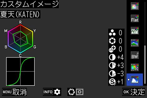
It is surprising that G and M are emphasized instead of B and C as colors. As expected, the tone curve image shows a very strong contrast. Sharpness also seems to be applied to create a crisp picture.
With this in mind, I started trial and error with ART.
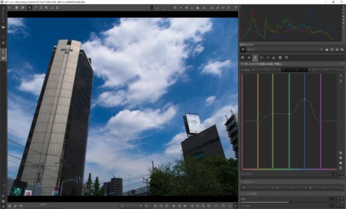
■ “Exposure” tab: I boldly tweaked the “Tone Curve” to lift the bright areas and reduce the dark areas by a wide margin.
■Detail tab: In the difficult “Sharpening” section, I chose “Unsharp Mask,” which I can barely handle, and “Sharpen Edges Only” to make the image less rough. Then I zoomed in on the editing effect and set the radius and the amount of sharpening by eye. The edges are now somewhat crisp.
■Color tab: I tweaked the “Color Equalizer,” which I am not sure how to use. I tried increasing the saturation of G and M as I had been informed, but I could not get a satisfactory result. The sky, which is the most important part of the image, is cyanish in color, so I go with my intuition (!) and increase the saturation and brightness of B as much as I can.
The “color equalizer” is the one on the right. It is quite difficult for beginners.
I felt that I hadn’t yet achieved a pleasing blue sky color, so I tried to further tweak the hue with the “channel mixer,” but the person I showed the image to pointed out that the white color getting muddy, so I gave up on the hue tweaking.
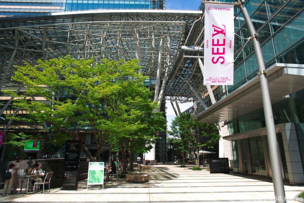
As a result, we managed to create a tricky “Summer Sky-ish” profile. Let’s compare it with the original “Summer Sky” shot.
Thanks to the Louis Vuitton event taking place at the location where the photo was taken, there was a subject that was just like a color sample book, making it a convenient to compare the photo colors. On the other hand, it is easy to see that the colors are not perfectly copied. It is difficult to make up for this slight difference, which is the sadness of an amateur.
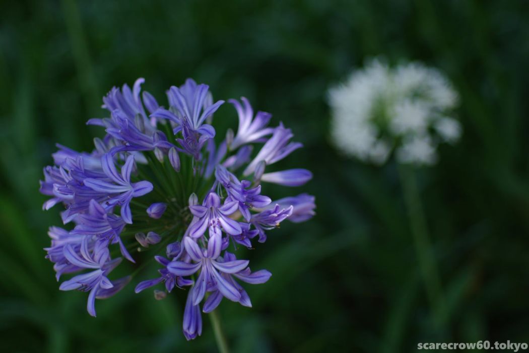
I would like to show you one more photo to show that blue sky may not be the only “summer sky” photos.
I was not able to fully fill in the “slight difference” in this one either… I was not sure if the hue did not match, the saturation was different, or the brightness was different… It was very difficult for me to figure out what was wrong.
I am now deeply aware that the process of “making the colors the same” is very deep, even though I only tried to imitate the process at the entrance.
Anyway, I was fortunate to have a messy nature, and I was able to make “Summer Sky-ish” as good as I could allow it to be. This time, I used the HD DA15mm limited lens designated by PENTAX, but now I am ready to develop summer sky photos with any lens. Summer holidays is just coming around the corner.