It is often said that “Sigma lenses produce cold tints”. You must have heard or seen this before, right?
I have used several Sigma lenses myself, and until now, I had not paid much attention to such comments, and had simply ignored them as if that was the case. However, when I acquired the SIGMA 17-70mm Contemporary standard zoom lens the other day and took a few shots with it, I was surprised.
It was true that the plants looked different and azure. At the same time, I also thought, “No, no, I don’t know, maybe I just have a preconceived notion that this is how it looks because I’ve heard so many people say so.”
Since the 17-70mm standard zoom is likely to be used frequently, I wanted to try it out myself and see how it really is.
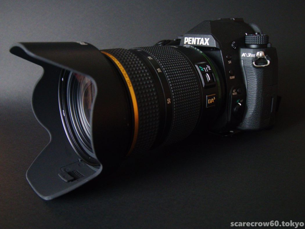
So, this leads me to my previous article. I took out two Sigma lenses and two genuine Pentax lenses of similar focal lengths, set them up on a tripod, and compared them. One of the lenses was the new DA*16-50, which was the subject of my last article, as well as the tripod, to introduce the newcomer.
So, let’s get right to the main topic of this issue.
SIGMA 17-70 48mm F8
SIGMA 50mmMACRO F8
PENTAX DA55-300 55mm F8
PENTAX HD DA*16-50 50mm F8
*The photos are not “jpg as-shot” but RAW data corrected with Adobe’s lens profile and applied with Adobe’s camera profile for K-3III (“Natural” in this case) .
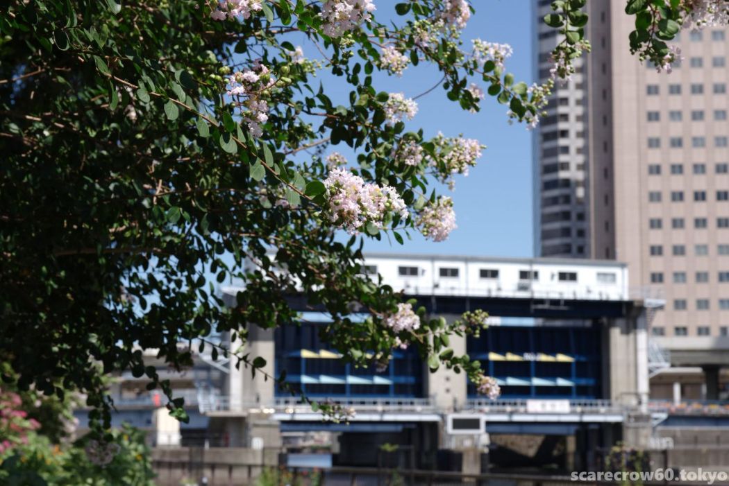
Compare four shots taken at the same focal length of around 50mm and the same f/8, and see what you get.
Since they were taken at the same place at the same time, it is natural that they look the same at first glance. If we take a closer look and compare them from there….
The following is my impression of the “color tones” of the four lenses.
1) The Sigma lens does not seem “cold” at all.
I think this is already true as I see it. I am sure that there is a difference in color as described below, but it is not “cold” at all. At least to me.
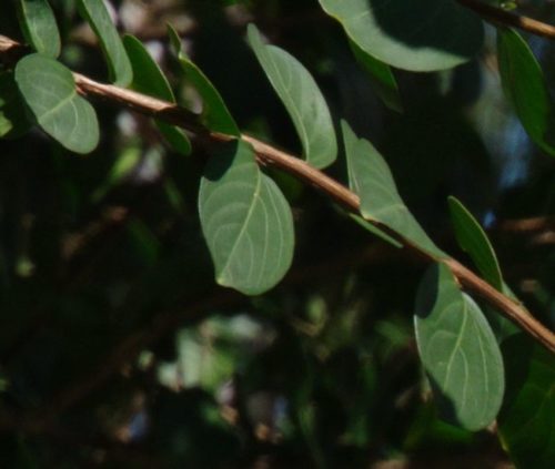
2) I feel a difference in the “color of the bright leaves in the sun”.
Because the wind is blowing and the position of the in-focus flowering branch of the tree in the foreground is moving, the rays of light are slightly different at the four points. Therefore, it is difficult to compare the flower and branch/leaf images under the same conditions, but still there seems to be a solid difference between the “darkest” DA*16-50 and the “lightest” SIGMA50 MACRO.
Expanded cropped DA*16-50
Also SIGMA50MACRO
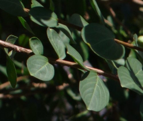
This seems to make it difficult to distinguish and talk about the difference in the angle of reflection and slight exposure of the light rays, so here’s another one
.
3) I sense a difference in shading in the color of the wall of the building on the right.
The angle of the light rays on the wall should be almost constant. Unfortunately, the wall is blurred at the back, but even so, the difference in color can be seen rather clearly. Here is a list of four images in order from the wall with the darkest color to the wall with the lightest color.
DA*16-50 50mm

DA55-300 55mm

SIGMA17-70 48mm

SIGMA50 MACRO

Again, I find the Sigma lens to have a “paler” color than PENTAX lens. At the risk of sounding harsh, and based on only a few lenses I have on hand, and based on the results of a very poor test shot, I think it would be correct to say that the Sigma lens has a unique color rendering.
However, when I wrote “pale,” I wondered if the word “pale” was really the right word.
How should I describe this unique color tone of the Sigma lenses?
I don’t think “pale” is the right word, but I don’t think it is what people call “cold” or “blue” either.
After careful consideration, I am going to say something rather crude, but for me, the best way to describe it would be “more transparent,” as if the transparency of the white background is increased by a percentage, rather than the color changing to a blueish tone.
The white board that is considered “white” by the white balance at that time is in the background, and it looks slightly translucent. It is a little different from “white” and “pale”.
My inner language is Sigma lenses are 5-10% more transparent. So when I look at the finished product, expecting the same color tone as the genuine Pentax lens, I get a “somewhat translucent” feeling. But it’s a beautiful translucency and I don’t dislike it.
It was a trivial and selfish experiment, but I was able to verbalize the color tones of Sigma lenses in my own way, and I feel much better about it.
But I was also relieved to learn that there will be no more new Sigma lenses in the K-mount lineup. What a pity.