It’s been a while since I took my Lumix G99 out for street photography, and incidentally, it’s been a while since I’ve tried to put a L.Monochrome finish on my photos.
It seems like it’s not talked about very openly for geek reasons, but the “L” in “L.Monochrome” is the “L” in Leica, right? It’s an “L” for Leica in the sense that Panasonic is trying to reproduce Leica’s monochrome photography with LUMIX cameras and lenses, and Leica tacitly approves of such attempts by its partner manufacturers.
What do you think?
I have never been a Leica user or an avid viewer of Leica photos, so I have no ability to judge whether these photos are a good approximation of Leica BW photos or not. I can sense the characteristics of “blacks are dark and the contrast is a little strong,” “blacks are not blacked out,” and “the picture is fine”.
I feel that this is a finishing method that produces “BW photos with atmosphere,” to use a vague adjective.
For example, this photo is taken with
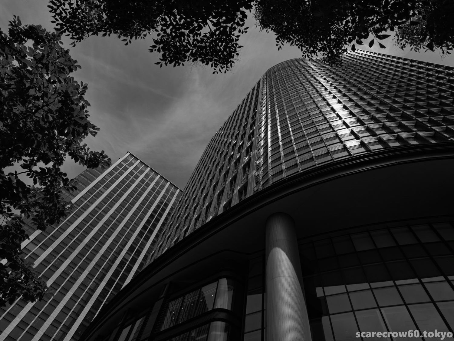
I love the gleam of the bluish dark tiles and the design of the rounded silver window frames on the exterior of this old building near Yurakucho Station, and when I took this photo, I naturally thought it would be finished in color. However, when I finished the photo in L.Monochrome, I realized that the history of the building is fragrant, and that black and white was the right choice.
The white of the signboard is too much emphasized in this photo of Ippodo, which is unbalanced.
It seems that if the subject matter is good enough to emphasize contrast, it’s not good enough.
I should probably come out. I said that all of the photos in this article have an L. Monochrome finish, but that’s a lie. I used “L Monochrome.dcp” profile for Lumix cameras provided by Adobe. The results are quite similar, but not same. It’s not a matter of whether they look like Leica or not.
BTW I think this way of finishing is quite good, especially for street snapshots. Here is another one.
It’s hard to explain the “nice look.” It is a multiplication of the fact that it is monochrome and the way it is finished, so it is a decade or a century too early for me, a beginner in both photo appreciation and vocabulary, to talk about it in the first place. But I dare to try.
“When the fish is dried, it tastes different from when it is raw.”
“Lack of color information make viewers richer in imagination. The fine texture makes it easier to stimulate the viewer’s imagination.”
“The sense that the scenery is real is diminished, and it feels a little deformed and abstracted, separated from reality in terms of time and space.”
I am not at all sure if I can share the feelings of others, or if they are in line with the standard viewpoints of the experts.
Anyway, the “L Monochrome.dcp” profile is quite a favorite of mine.
Photography equipment: Lumix G99, Leica DG12-60