This time, it is an interlude fill-in-the-blank article that has little to do with photography, even though this is a photography blog.
Now, this site uses Japanese web fonts. So far, I have generally used the following two.
Noto sans JP
M plus 1p
Both are in the Google fonts lineup and are widely used standard gothic fonts. The former is a neat typeface that is widely used in all genres regardless of whether it is hard or soft, while the latter, which was created jointly by google and adobe, is a typeface with a slightly casual impression with a wide curved edge, and is often used in entertainment sites.

In any case, regardless of the browsing environment of the viewers, they should always be able to see the same font design by referring to resources available on the Internet. In order to make my ramblings look a little lighter, I have just started trying M plus 1p instead of Noto sans JP, which I feel is a little too formal.
However, I ran into a bit of a problem with it.
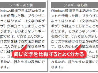
The M plus 1p font has a weak point in the Windows environment: when small letters are enlarged and displayed on a large (high-resolution) monitor, the display becomes distorted. The lines of the characters are crushed and jagged…I heard it is called shaggy…and it appears.
It’s faster to see the real thing, this kind of thing.
 Yes, you can see the jaggedness and varying thickness.
This is easy to explain because I took and pasted a shot of the shaggy symptoms on a large screen monitor, but you don’t notice it while you are usually looking at it on a smartphone or a PC with a small monitor screen.
I thought this is not very nice, because many of my readers who are interested in photography (which is just my brain’s fantasy, and most likely does not exist) may view the Web on a large monitor, such as 27 inches or larger.
I had no choice but to switch back to an anti-aliased font (such as Noto Sans JP) that smoothed out the shaggy symptoms, but I was still puzzled…I wondered if there was anything I could do.
Then one day, I suddenly learned that users can take some measures to solve the shaggy problem of Web fonts. The source of this information is, for example, this site.
It seems that this is already widely known, and as usual, I’m a laggard. In short, it seems that if you tilt the display of shaggy characters just a little so that they are not noticeable, the symptom improves.
I see!
Specifically, I rotated the font by about 0.03 to 0.07 degrees in CSS, using the transform property
Use the transform property and set
transform: rotate(0.03deg);
where 0.03deg means 0.03 degrees clockwise.
I am using the WordPress theme Cocoon, which allows me to make any additions to the theme’s default CSS, so I should be able to find the tag for the article body font and add the above.
…I got this far, but the rest of the process is a bit of a backslide. It’s hard for a weak-minded middle-aged person with only half knowledge to find the tag for the body of the article, even after looking at the CSS.
I got tired of it, and decided to do it this way, and then I tried to specify it roughly like this.
body {
transform: rotate(0.04deg); }
}
(0.04 is the number I determined by eye to be the best result after trial and error with different rotation angles).
The display is now changed to this.
Compared to the “before rotation” image, the shaggy areas are less noticeable (though not completely), and the image looks much nicer!
However, although it looks like it worked at first glance, it seems that specifying “the whole body” was reckless. Although they say “it’s not noticeable at first glance,” they rotate not only the text of the body, but also the heading text, title image, embedded photos, banners, and even decorative lines.
As far as I noticed, the Lightbox display on the “Gallery” page, where example photos are arranged, was broken. The enlarged photos no longer fit the screen size.
I guess I shouldn’t be so reckless (of course). I guess I’ll just have to load the style sheet steadily.
It took me two days, but I finally found the tag for the “body” part of the article. It took a detour, but I think it looks like this
.main {
transform: rotate(0.04deg); }
}
Now all parts of the blog are settled. Maybe this is the right answer.
Now that we have a shaggy solution for the time being, it looks like we can use M plus 1p on a regular basis from now on.
Or rather, as of June 2023, when this article was published, all the articles including the past articles have already been done so. How do you like the look?